Then there's the other version — the one that stops you. The one where you scroll twice before you even read the headline, because something about the feeling of the page pulled you in. Those sites are rare. But when you study them long enough, patterns emerge.
I've been looking at two in particular that I added to the Some Select catalogue recently. Here's what I found.
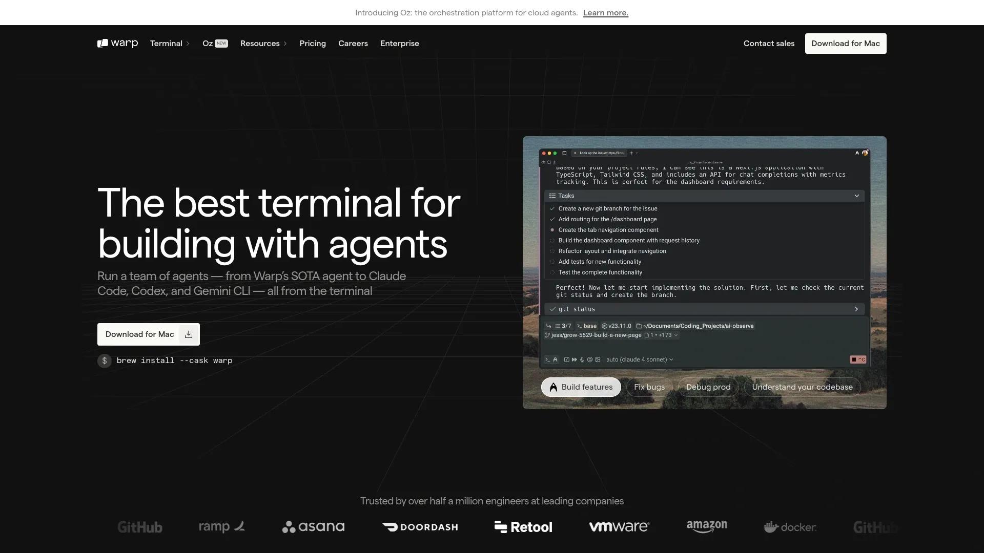
Warp — when restraint becomes a statement
Warp (#030) is a developer tool — a reimagined terminal. That context matters. Its audience is technical, skeptical of marketing fluff, and allergic to anything that looks like it was designed by a committee.
The site knows this. It's minimal, dark, futuristic — but not in the way SaaS sites typically try to be futuristic. There are no particle animations, no oversized hero blobs, no "we're changing everything" copy. Instead, the interface itself is the hero. You see the product. You understand what it does. The design gets out of the way.
That's harder to pull off than it looks. Restraint in web design isn't the absence of decisions — it's the result of very deliberate ones. Every element on a page like this has earned its place. Anything that couldn't justify itself was removed.
The lesson: knowing your audience well enough to remove things is more powerful than adding them. Most SaaS sites try to say everything. Warp says exactly enough.
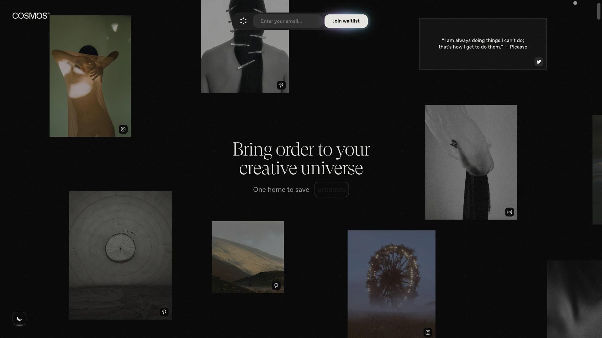
Cosmos — when experimentation earns its place
Cosmos (#035) takes a different approach entirely. Glassmorphism. Full-screen video background. Parallax. Experimental layout. On paper, it's a list of every trend that gets criticized in design Twitter.
In practice, it works — and understanding why is the interesting part.
Cosmos is a tool for organizing your internet — bookmarks, links, the things you save and never find again. It's a product about collecting beautiful things. The aesthetic isn't arbitrary: it mirrors what the product does. A site about curation should itself feel curated. A tool for visual people should feel visual.
Built on Next.js with a level of animation polish that takes real engineering investment, the site is confident in a way that only works when the product backs it up. If Cosmos were a mediocre tool, this design would feel like overcompensating. Because it isn't, the site feels earned.
The lesson: experimental design only works when it's honest. If your product is bold, your site can be bold. If your product is utilitarian, your site should be too. The mistake isn't choosing a style — it's choosing one that doesn't match what you're actually building.
What separates the memorable from the forgettable
Looking at both sites alongside the dozens of SaaS landing pages I scroll through every week, the gap always comes down to one thing: coherence between product and presentation.
Warp's restraint is coherent with building tools for developers who distrust excess. Cosmos's richness is coherent with building a product for people who care about beauty. Neither is trying to look like the other. Neither is trying to look like everyone else.
The forgettable landing page sites are the ones where the design could belong to any product. Strip the logo, change the headline — it could be a project management tool or a payroll platform or an AI writing assistant. The aesthetic has no relationship to what's being sold.
The memorable ones are inseparable from their product. You couldn't use Warp's site for Cosmos, or vice versa. That specificity is the work.
A note on what this means for founders
If you're building a SaaS and about to brief a designer on your landing page — or buy a template and customize it yourself — the most useful question isn't "what looks good?" It's: "what does our product feel like, and does our site feel the same way?"
The answer to that question is your design brief. Everything else follows.