I've been looking closely at three in the Some Select catalogue that stopped me for different reasons. Here's what each one gets right — and what it teaches.
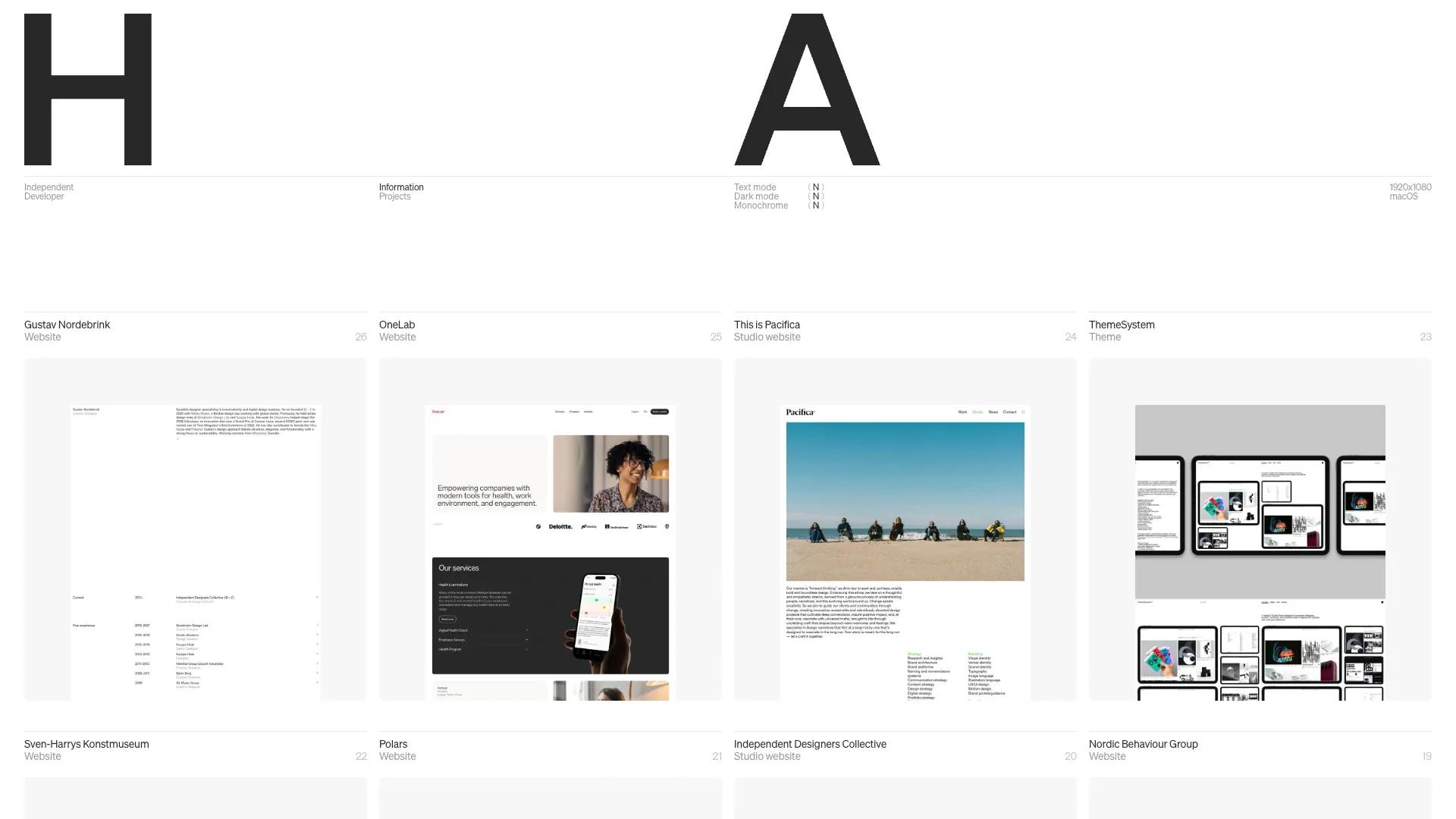
Harry Atkins — when contradiction becomes identity
Harry Atkins (#031) is one of the more unusual portfolios I've encountered. Bold and dark, but also light. Brutalist, but also futuristic. Monochrome, but also experimental. Built on Astro with a grid structure that shouldn't work as well as it does.
The contradiction is the point. Most personal portfolios try to establish a single, coherent tone — pick an aesthetic and commit. Harry Atkins does the opposite: it cycles through visual registers in a way that feels deliberate rather than inconsistent. The result is a site that communicates range without ever having to say it.
This is genuinely hard to pull off. When you try to be multiple things visually, you usually end up being nothing. The reason it works here is that each section is fully committed to its own register — there's no half-measures. The brutalism is really brutal. The futurism is really futuristic. The transitions between them become the personality.
The lesson: range as a design strategy only works if each mode is fully realized. Half-committed contradictions read as inconsistency. Fully committed ones read as depth.
Yanchen Zhao — the power of the one-pager done right
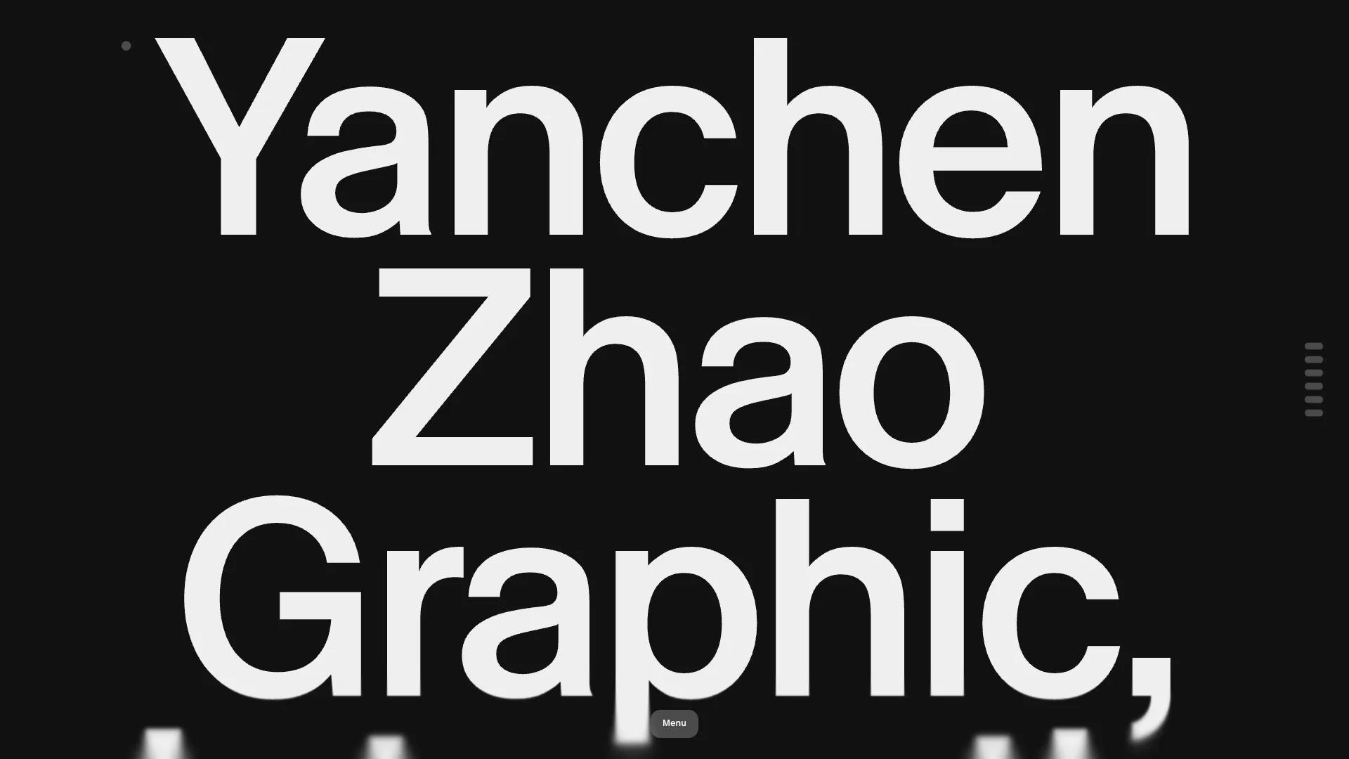
Yanchen Zhao (#029) takes a completely different approach. Minimal, dark, typographic — one single page with scrolling animation, built on Framer.
The one-page portfolio is a format that gets dismissed easily. "Not enough room to show your work." "Too limiting." But Yanchen Zhao's site demonstrates something that multi-page portfolios often miss: clarity is a competitive advantage.
When you have one page, every decision has weight. You can't bury weak work on page four. You can't hide behind navigation. Everything the visitor needs to know about you has to live in a single, continuous scroll — and it has to earn their attention at each step.
The typographic approach amplifies this. Typography-first design creates a rhythm that guides the eye without relying on imagery to do the heavy lifting. It communicates that the designer thinks in structure, not just decoration. For certain clients — particularly tech founders and startup teams — that's exactly the signal they're looking for.
The lesson: constraints produce focus, and focus produces trust. A site that knows exactly what it wants to say is more convincing than one that tries to say everything.
Specimen Studio — when personality is the portfolio
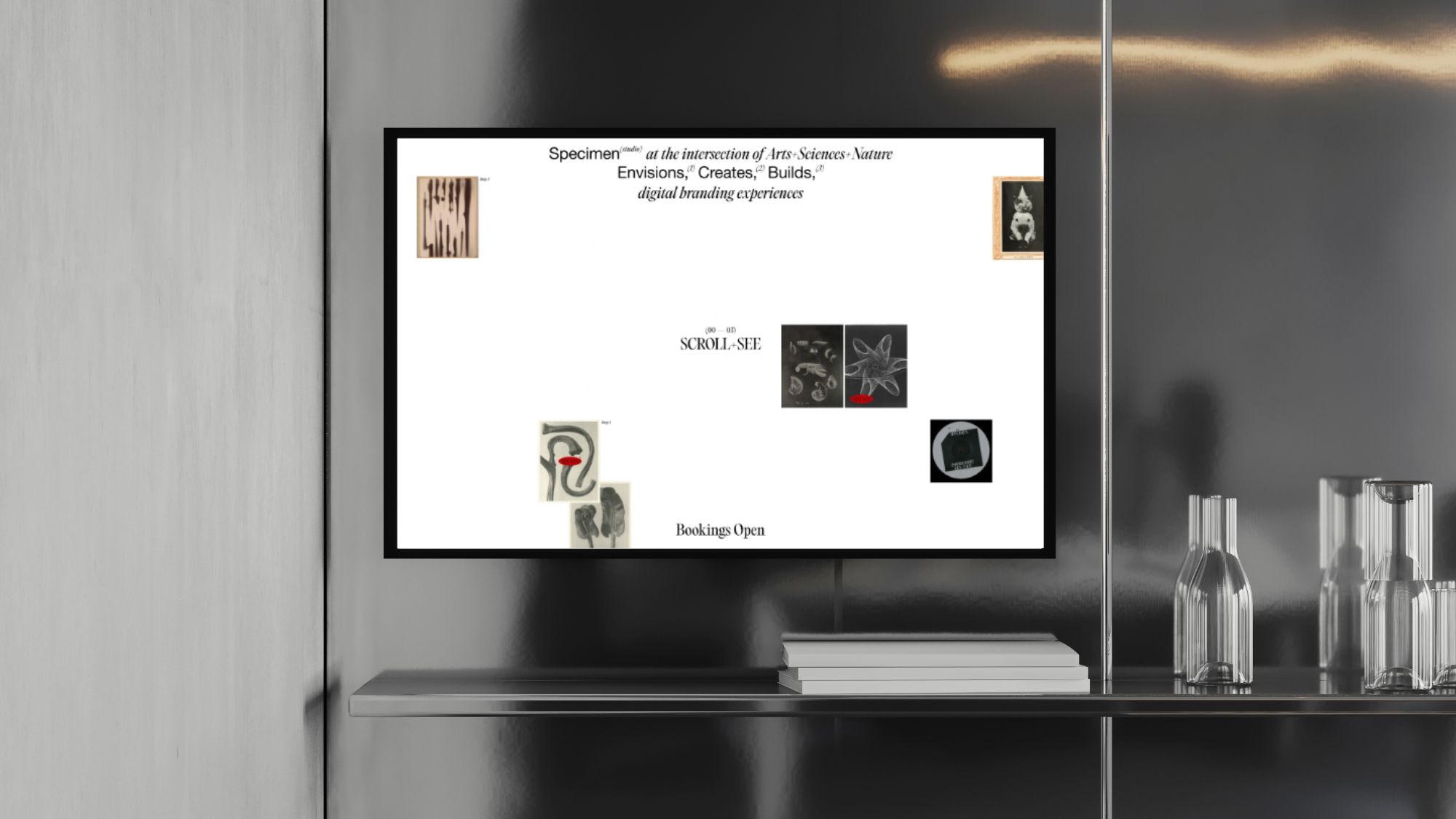
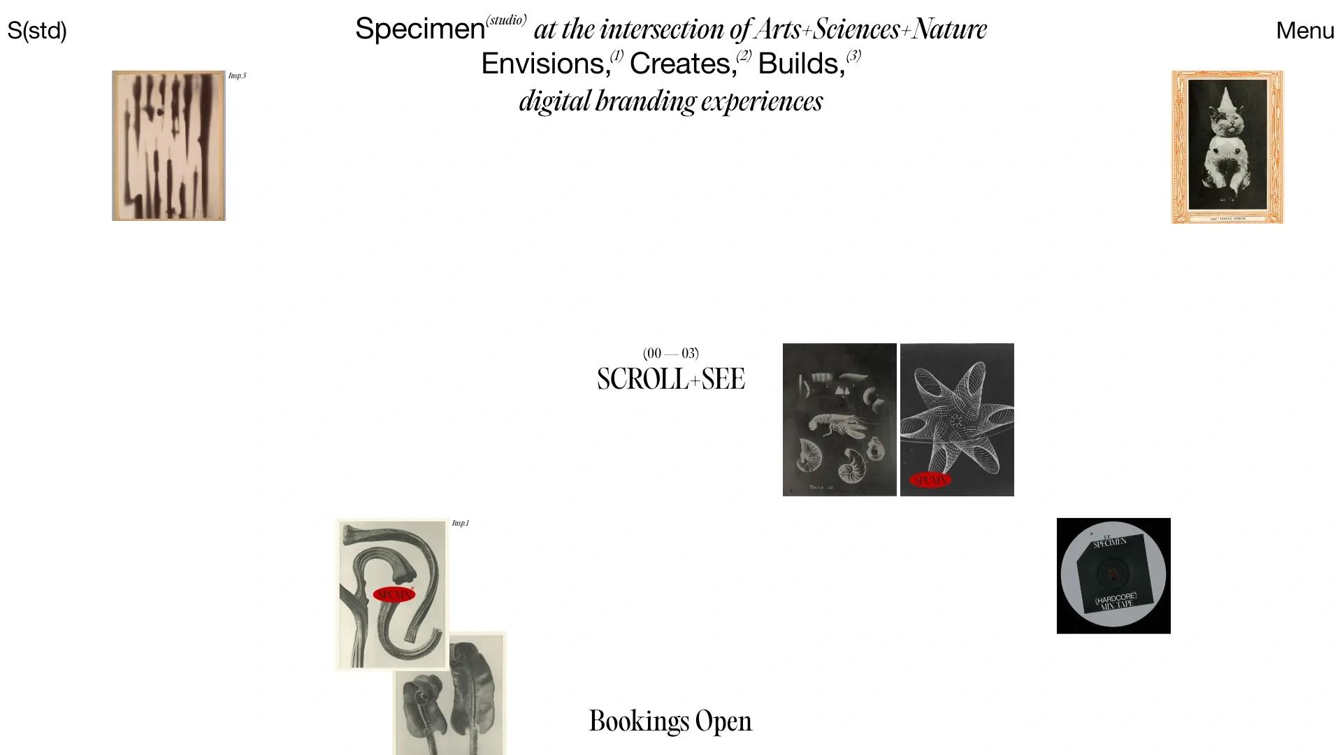
Specimen Studio (#036) is the most recent addition to the catalogue, and it takes yet another approach. Bold, editorial, illustrated, retro — with scrolling animations and a typographic sensibility that feels closer to print design than web convention. Built on Webflow.
What makes Specimen Studio unusual is that the site's personality is so strong, you almost don't need to see the case studies to understand the studio. The aesthetic IS the pitch. You know immediately: these people have a point of view, they like bold typography, they think about design with the same seriousness that editorial designers bring to a magazine spread.
This is the highest-risk approach in portfolio design. It filters aggressively — the clients who love this site will really love it, and the clients who don't connect with it will move on. But that filtering is by design. A studio with a point of view doesn't want every client. It wants the right ones.
The lesson: a distinctive personality attracts the clients who are worth working with. Playing it safe gets you more inquiries. Playing it true gets you better ones.
What the three have in common
Harry Atkins, Yanchen Zhao, and Specimen Studio are stylistically very different. One is brutalist and contradictory, one is minimal and typographic, one is editorial and retro. They share almost no aesthetic DNA.
But they share something more important: each one has a point of view, and that point of view is consistent all the way through. There are no borrowed ideas, no hedging, no "this looks like what a portfolio is supposed to look like." Each site knows what it is.
That clarity — more than any specific style choice — is what separates the memorable from the forgettable.